Case Study
BalTerminalStroy
A new site for a builder of reinforced-concrete dome stores: from Tilda to React, a hero video where the domes rise before your eyes, mobile as a separate product, forms, legal pages and SEO.
- Client
- BalTerminalStroy (БАЛТТЕРМИНАЛСТРОЙ), St Petersburg: since 2000 it designs and builds reinforced-concrete dome stores for bulk cargo
- Audience
- B2B: customers of terminals and stores, investors, design institutes, including foreign ones
- Languages
- Russian and English
- Year
- 2026
- Scope
- migration from Tilda, redesign, hero video, mobile version, hosting move, forms, legal pages, SEO, social previews and analytics
- Stack
- Lovable (React, Vite, TanStack Start, Tailwind CSS, shadcn/ui), Higgsfield, Claude, Playwright, GitHub, Vercel, reg.ru, Resend
- Team
- OpenWeb360 OÜ together with AI agents (Lovable, Claude)
Starting point
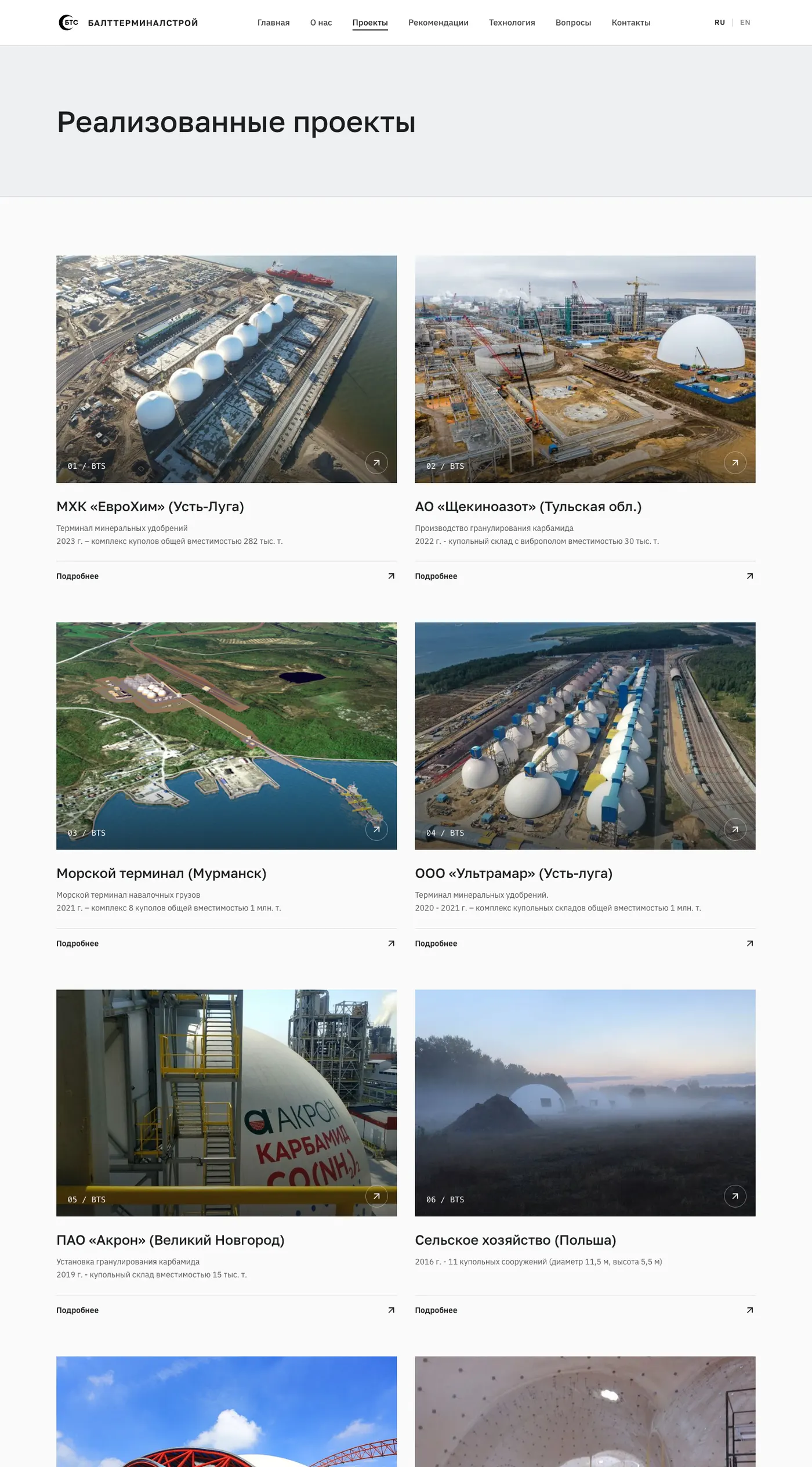
BalTerminalStroy has developed, designed, taken through expert review and built reinforced-concrete dome stores since 2000, for storing and transshipping bulk cargo such as mineral fertilisers. Its projects are in Russia, the CIS, Europe and Asia: EuroChem (Ust-Luga, a dome complex of 282 thousand t), Ultramar (Ust-Luga, 1 million t), Shchekinoazot, Akron, AS DBT (Muuga port, Estonia), a baseball stadium in Taiwan (a 70 m dome), clinker silos in Poland (64 m), sites in Spain.
The audience is B2B and the decision takes a long time. The site has to build trust: a portfolio, customers' letters, an understandable technology and a fast contact. The starting point was a bilingual (RU/EN) Tilda site: home, about, projects (10 project pages with galleries), references (scans of letters by year), technology (construction stages, a YouTube video) and contacts. Requests went through a Tilda form.
What was wrong with the old site
- Dependence on a builder: no control over code, speed, SEO or hosting.
- An illogical layout (text on the left, project cards in the middle, the project map at the bottom «on its own»), an outdated photo presentation (a card with a photo inside a highlighted card), random sizes and spacing, a typeface unfit for an engineering segment, animations that hardly worked.
- The mobile version was a squeezed desktop.
- SEO: the Russian pages had
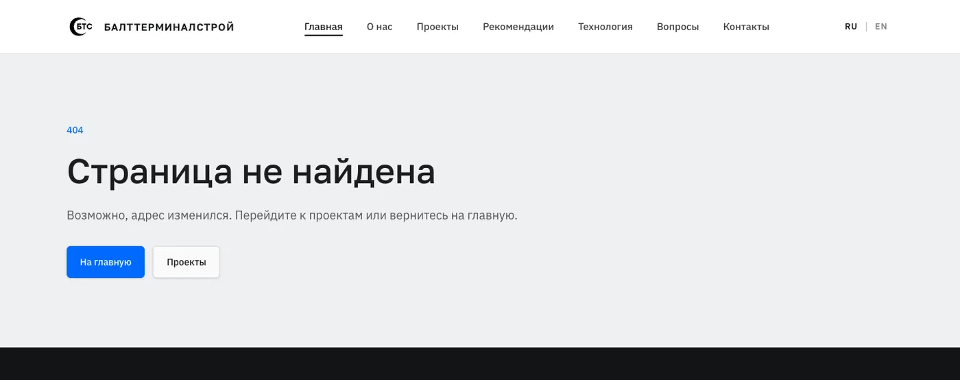
lang="en", and there was no canonical, hreflang, Open Graph image, structured data or sitemap. - Details: a stock YouTube player, a black-and-white favicon with letters, a cookie banner with a single «Accept» button, no legal pages, a form that depended on Tilda.
The task: a site that shows the engineering before the first word, belongs to the client (code, hosting, forms) and works in both languages and on mobile as a product of its own.
What we did and why
1. Migration and an honest base
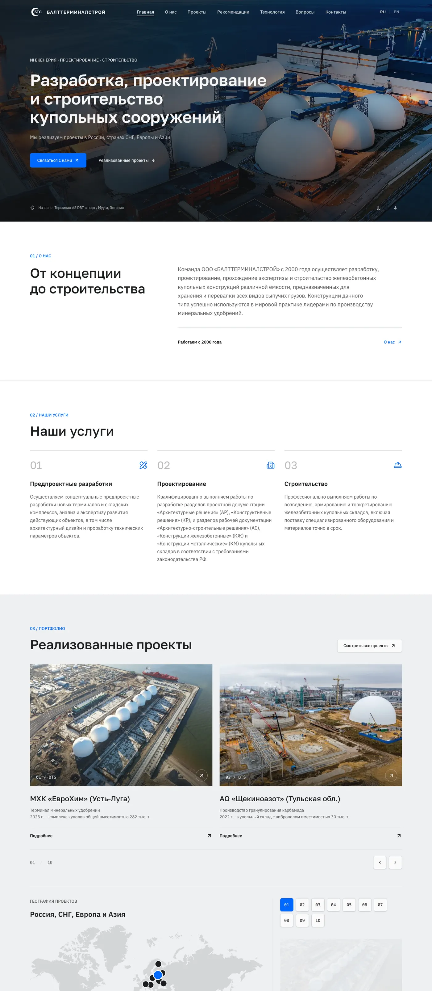
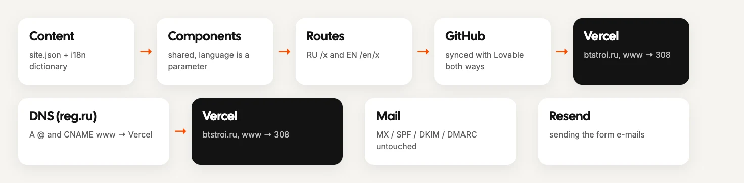
What we did. A static Tilda export → React components (Lovable). All content and media live in one place (site.json + an i18n dictionary), pages are shared components with a language parameter, and the routes are thin: RU /x and EN /en/x. Every old URL was kept (important for search). Then we compared it 1:1 with the original by screenshots: the typeface, the round contact button, carousels, the map, references by year, the black sections.
Why. Before improving anything you need an honest base: if the new site differs from the original by accident, you cannot tell later whether an improvement helped.
2. Design
Typefaces Golos Text and IBM Plex Sans (an engineering grotesque with good Cyrillic), one grid, a map tied to the projects, numbered sections («01 / About», «03 / Portfolio»), and working reveal animations that respect prefers-reduced-motion. On the photos we removed nested frames and glow, made the photos large, added a full-screen viewer and separated the letters (portrait documents) from the photos.
3. The key decision: a hero where the domes are built
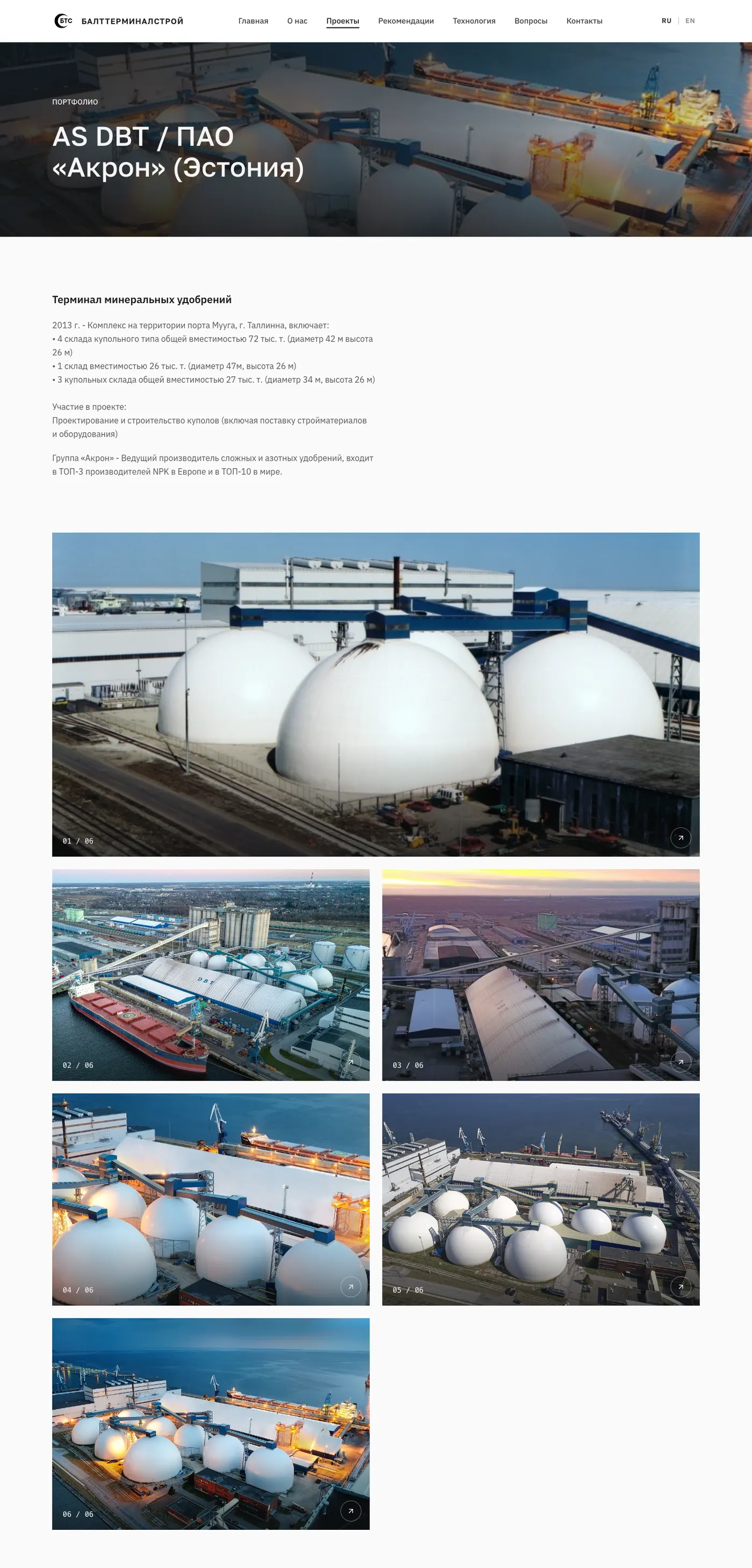
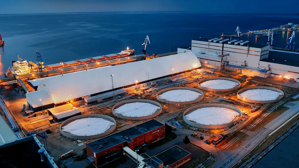
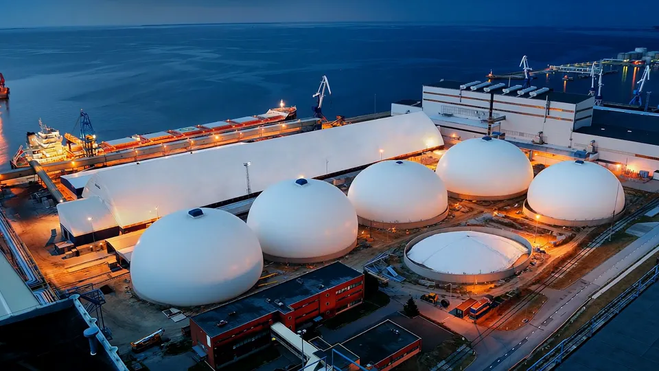
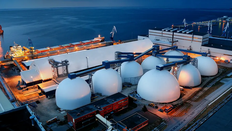
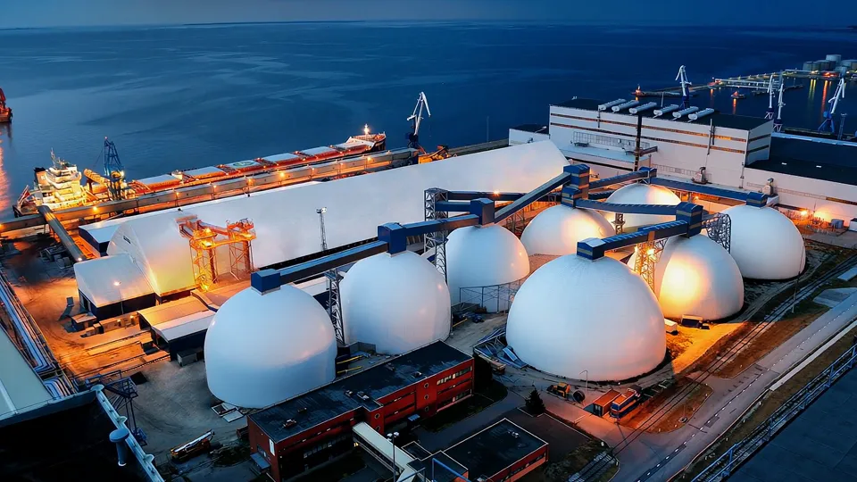
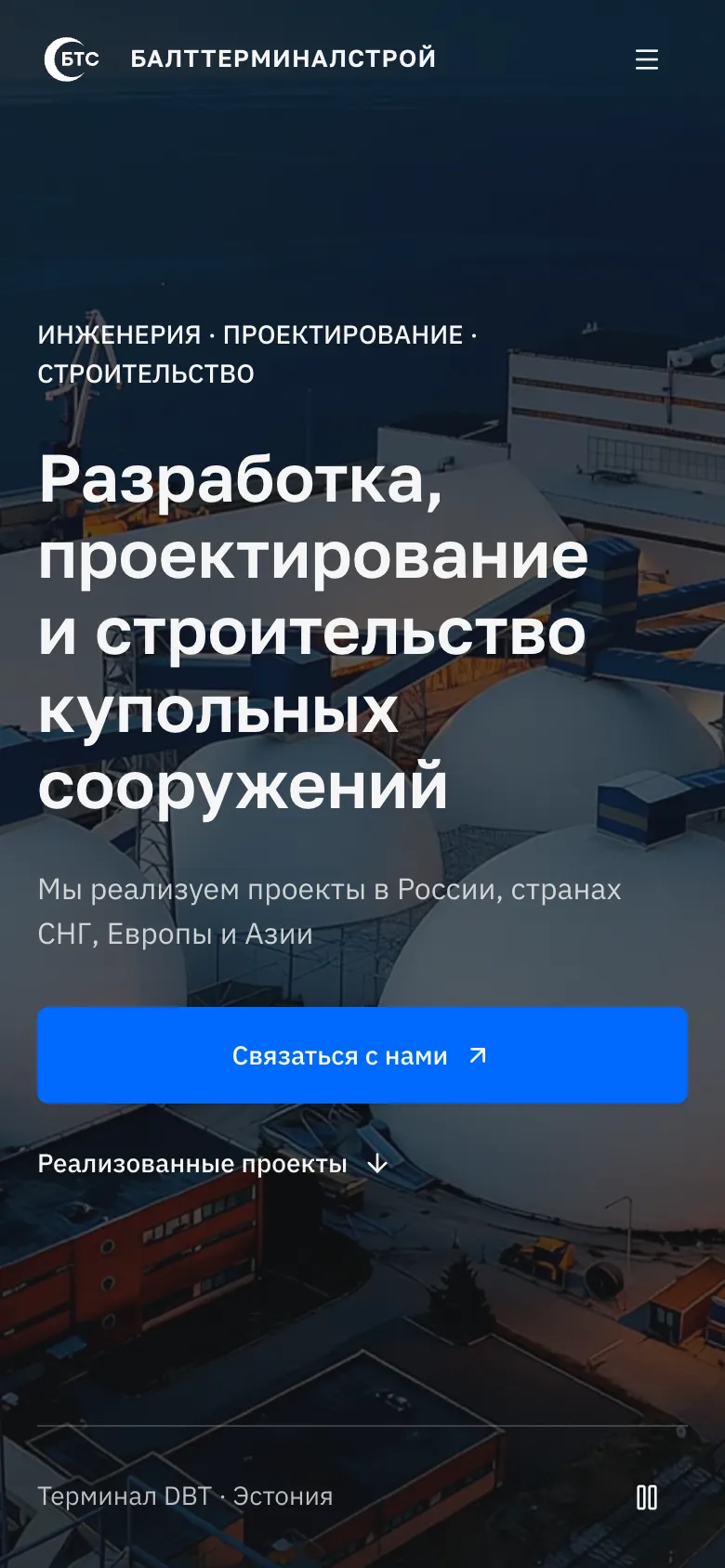
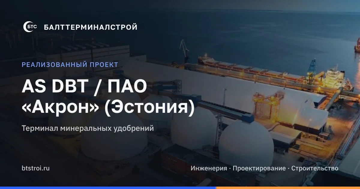
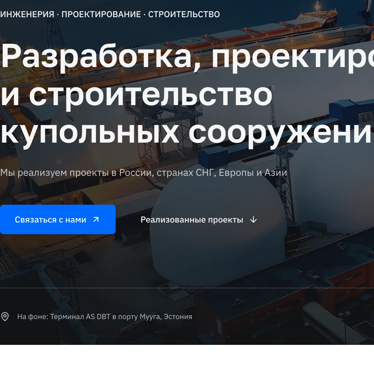
The photo of the terminal (AS DBT in the port of Muuga, eight white domes by the sea at dusk) is the strongest proof on the site. We built the hero around it.
- The «before» frame. In Higgsfield a «before» frame was generated from the photo (GPT Image 2.5): the same shot with round foundations and a membrane lying on them instead of domes.
- The video. FLUX 3 Video made an 8-second 1080p video: the first frame is «before», the last is the original photo; the membranes inflate and grow into domes.
- Behaviour. It plays once and stops on the real photo, then a slow Ken Burns; a pause/replay button; a poster with no black flash; with reduced motion, only the photo; if the browser blocks autoplay, the final photo is shown rather than empty foundations.
- Weight. The video is compressed for the web: MP4 2.7 MB and WebM 2.9 MB (the original was 19 MB).
Why. An engineer-buyer believes numbers and photos, but the first screen should show at once what the company does: the domes do not simply appear, they rise. The final frame is real, so the video is not a lie.
To be honest: the hero video is an AI visualisation, not real footage. The final frame is the real photo.

What we gave up. A looped video (it distracted and looked like a screensaver) and several variants of the «before» frame (iterations turned out not to be needed).
4. Mobile as a separate product and a full audit
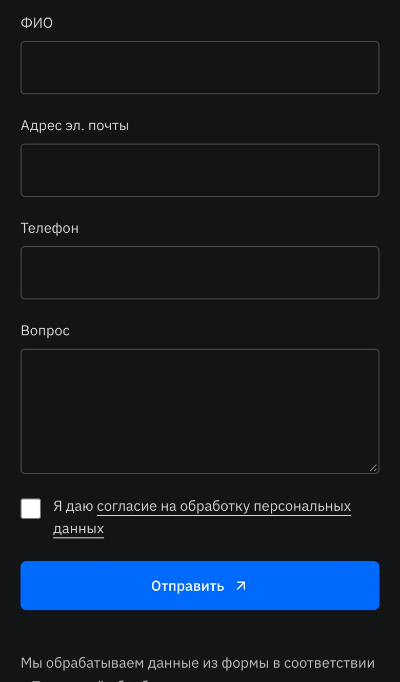
We audited 32 pages in RU/EN (Lovable plus automatic checks): one spacing scale, typography, grid, footer. Mobile was built as a separate product: a full-screen menu, a hero at full height (svh), swipe galleries, a compact geography block instead of a big map, a comfortable form and a contextual bottom bar «Call / Write». We checked each page on screenshots at 360/390 px: the cookie banner moved to the bottom and no longer covers content, single letters lost their useless «1 / 1» and arrows, the footer has large tap targets, and «Read more» appears only when at least 3 lines are hidden (before, the button expanded a couple of words). The result is a PDF report and before/after comparisons of every page at 390/768/1280/1440 px.
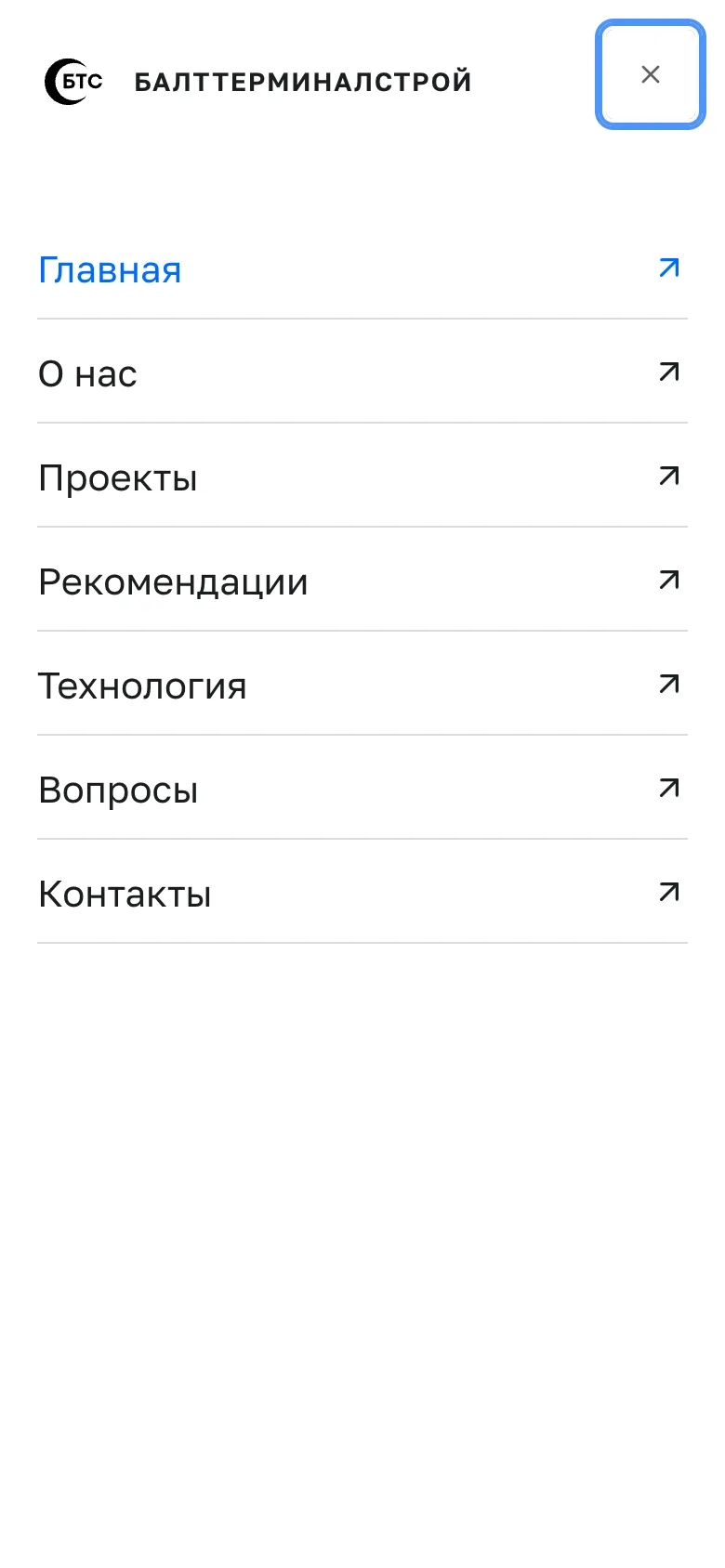
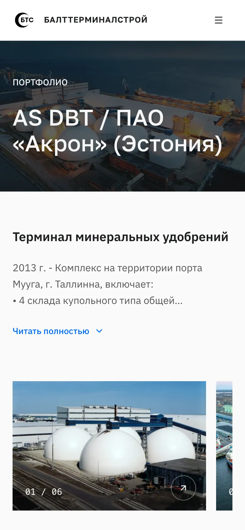

The header. The mark and «БАЛТТЕРМИНАЛСТРОЙ» on one line, the white logo rebuilt from the vector (the old PNG had letters with serifs), more air in the menu and an underline for the active item, and a language switch «RU | EN» instead of a globe icon (in the menu on mobile). On the home page, after scrolling 120 px, the header slides in as a white bar and stays visible (desktop and mobile).
5. A branded video player and an FAQ
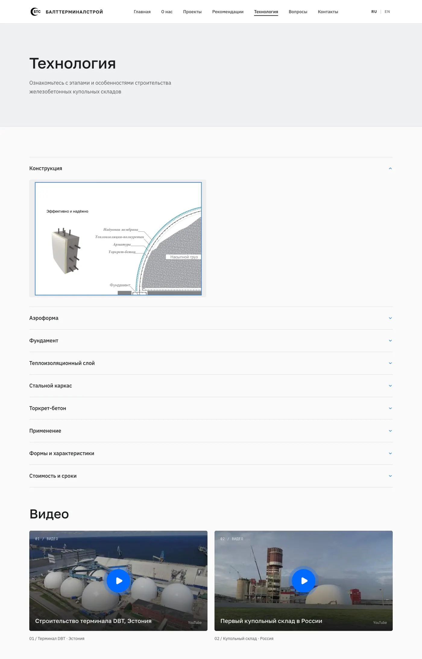
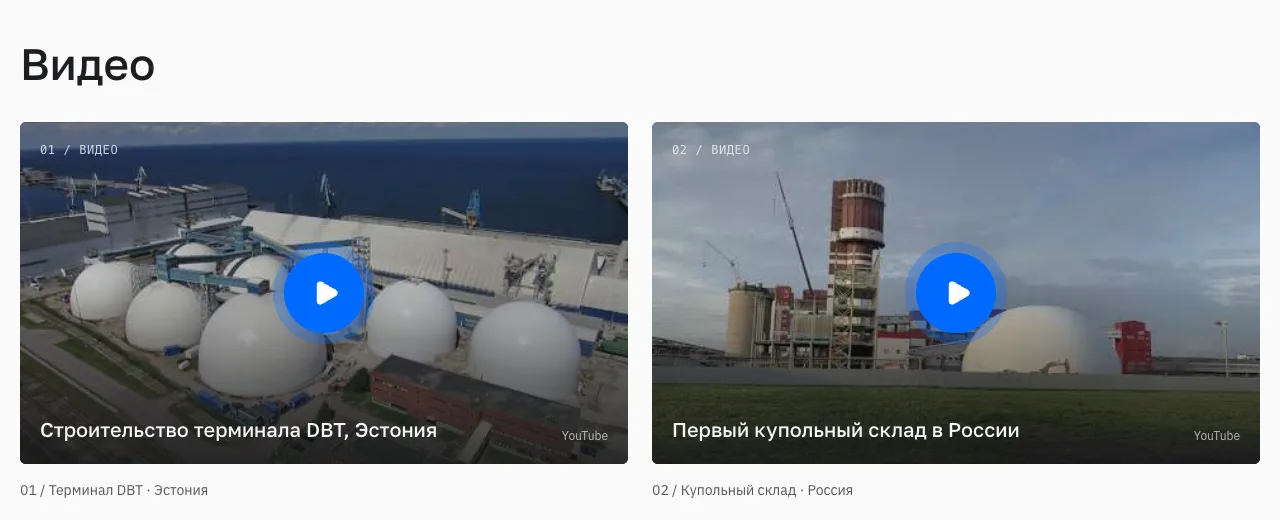
The player. Instead of the stock YouTube embed there is a card with a frame, a dimming layer, a blue pulsing ▶ button and a caption; the player itself (youtube-nocookie, with no third-party recommendations) loads only on click, so the pages are lighter.
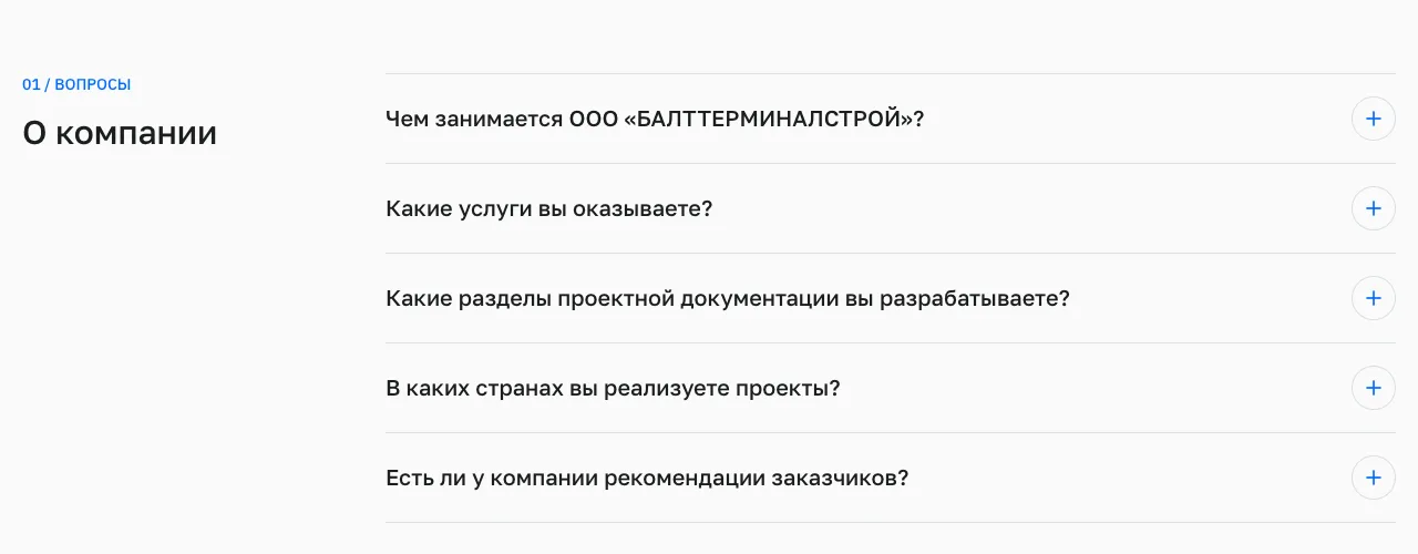
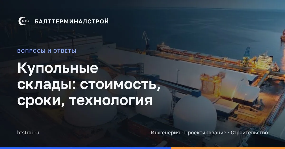
The FAQ page (/faq, /en/faq): 19 questions in 4 groups (the company, dome stores, technology, projects). The answers are only facts already published on the site, with FAQPage markup, links to sections, and an entry in the menu and the sitemap. We found a discrepancy in the source texts (the thickness of the reinforced concrete and of the insulation differs between the RU and EN versions), so those numbers were left out until the client clarifies them.
6. The favicon and its iterations
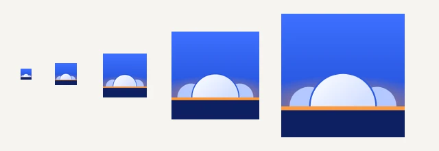
At first we made the BTS mark on a black tile. The client asked to move away from black-and-white and letters and to reflect the domes. The iterations: a dome with ribs (it read as a helmet) → a dome with a knot on top (a dish cover) → three domes with a thick outline (cartoonish) → the final: three domes on the horizon at dusk, the brand's blue gradient, an orange line of lights; readable from 16 px. Plus iOS/Android icons, a manifest and the browser bar colour.
7. The form: requests go straight to the company's mailbox
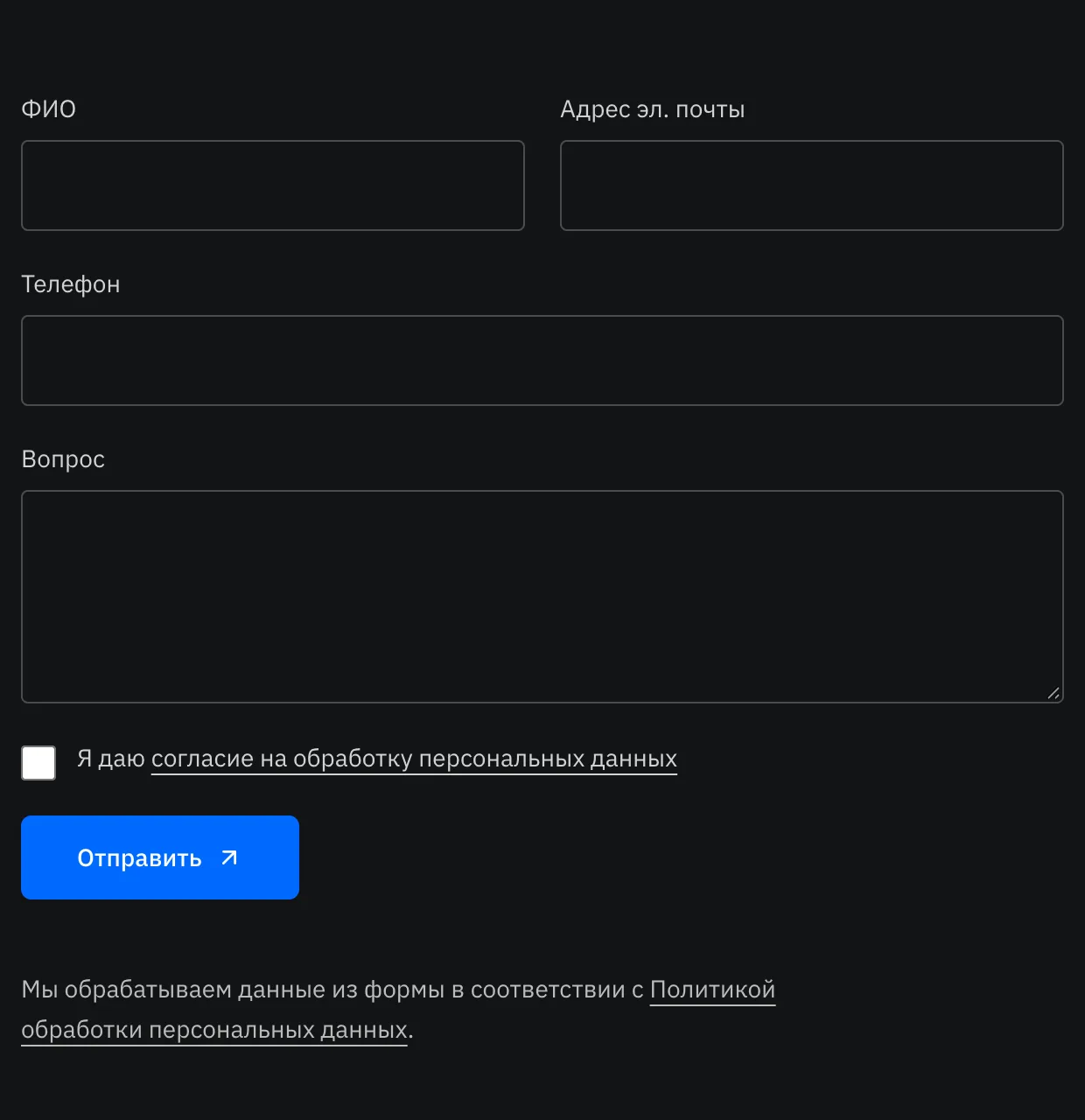
Before: the form opened the visitor's mail program (requests were lost). Now: a server handler /api/contact sends the e-mail to the company mailbox, with the visitor as Reply-To and the subject «Request from the site: name».
- We did not have the password to the corporate mailbox (and it must not be changed: that would break the staff's mail). So we connected Resend: the domain was verified with three DNS records, the key is in Vercel; SMTP through reg.ru stayed as a fallback.
- Protection: a bot trap, a too-fast-submit check, a limit of 5 requests per 10 minutes per IP, validation; on a failure the visitor sees a phone and an e-mail. Tested on a test SMTP server from every type of page, then live.

8. Legal pages and consent (152-FZ)
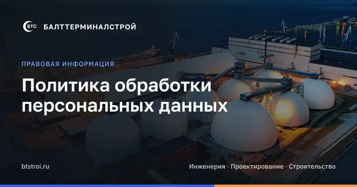
- RU/EN pages: a personal data processing policy, a consent to the processing of personal data (a separate document since 1 September 2025) and a cookie policy. Links in the footer and by the form.
- The form has a required consent checkbox (checked in the browser and on the server).
- The cookie banner: «Accept all» / «Only necessary» plus «Learn more», and a «Cookie settings» button in the footer.
- The fonts were moved from Google Fonts to our own hosting: visitors' browsers no longer contact Google.
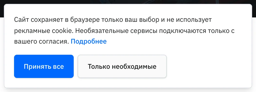
At the client's request, the names of foreign services were removed from the policy (they are now generalised as «hosting provider» and «mail delivery service»), but the sentence about possible cross-border transfer was kept: otherwise the policy would not match reality. Recommendation: show the texts to a lawyer (the legal address, the notification to Roskomnadzor, data localisation).
9. From Lovable hosting to our own Vercel and domain
The code is synced with GitHub (Lovable keeps working in both directions). We solved three blockers: the video lived in Lovable's internal storage (links /__l5e/… work only on their hosting), so it was moved into the repository; the lock file pulled a package from Lovable's closed npm cache (403), so it was switched to the public npm; the default build targeted Cloudflare, while Nitro detects the Vercel platform on its own. The site address for canonical, sitemap and OG comes from an environment variable, and sitemap.xml and robots.txt are generated by the server.
The domain: btstroi.ru is the primary address (without www: shorter and it matches the old links), and www redirects with a 308 to btstroi.ru. In reg.ru DNS: A @ and CNAME www to Vercel; the mail MX/SPF/DKIM/DMARC were left untouched.
10. SEO, social previews and analytics
- Technical SEO: the right
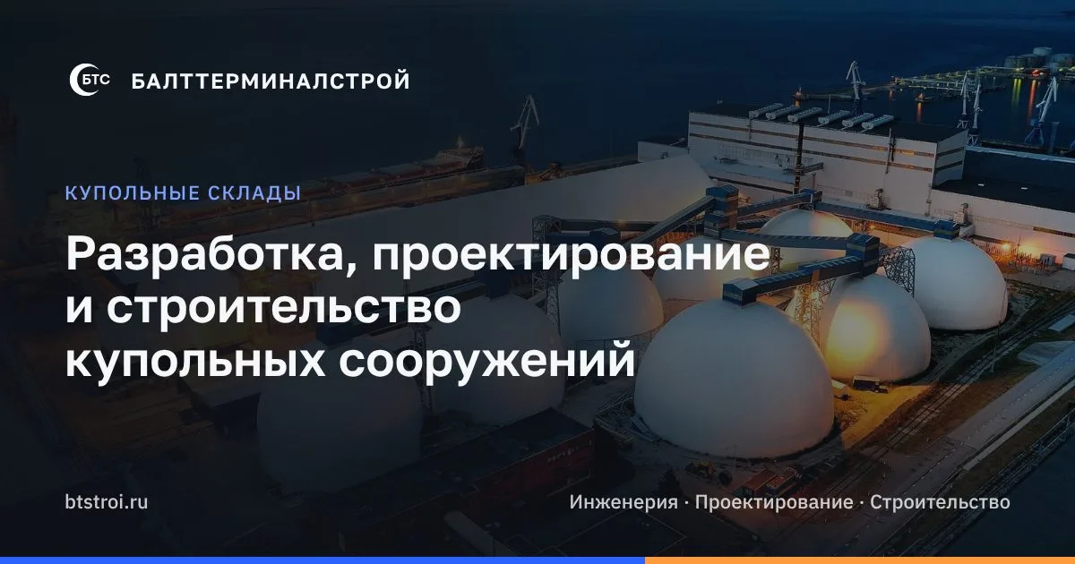
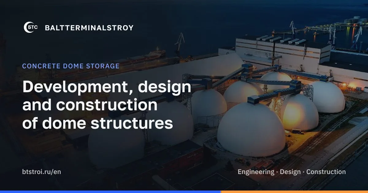
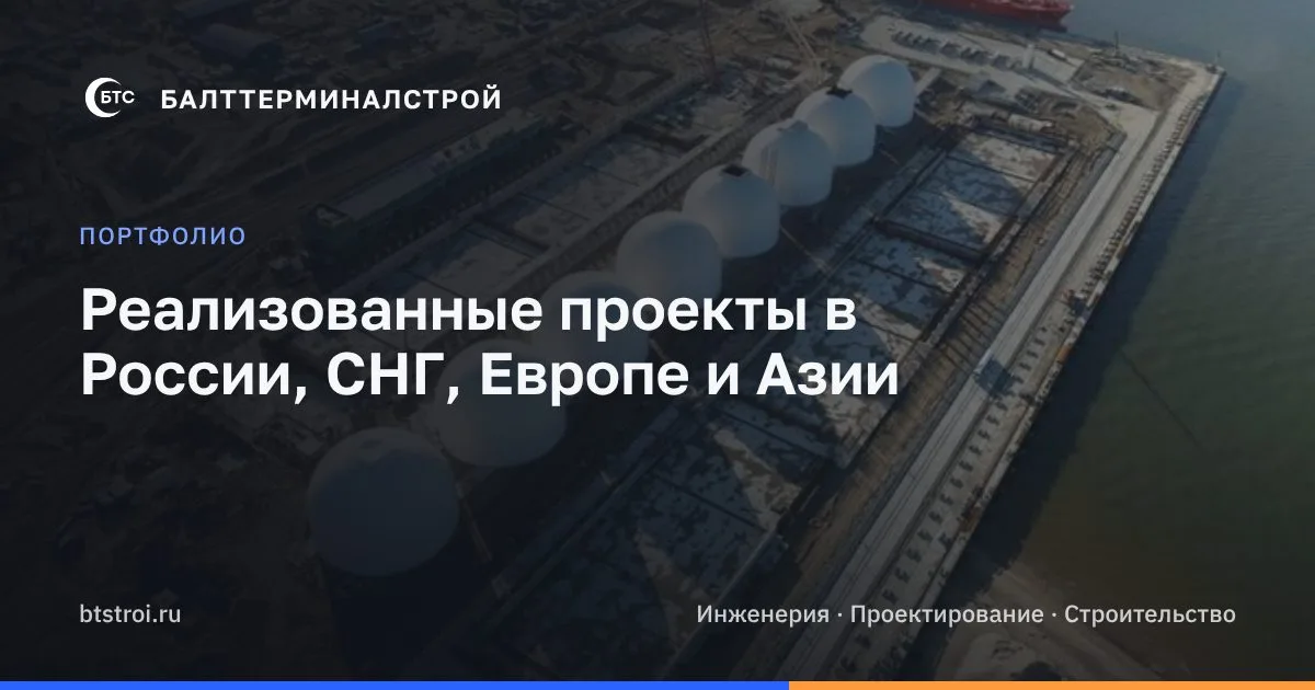
lang, unique titles and descriptions with the target queries («купольные склады», «железобетонные купола», «склады для сыпучих грузов», «терминалы для минеральных удобрений»; EN «concrete dome storage», «bulk storage domes»), canonical, hreflang, JSON-LD (Organization, BreadcrumbList, projects) and a 404 page in the site's style. - Social previews: 40 branded 1200×630 cards (every page and every project in its own language: a photo, the logo, a title, the address) and a full set of Open Graph / Twitter tags.
- Search and measurement: Google Search Console (verified with a DNS TXT record, the sitemap submitted), Yandex Webmaster and Yandex Metrica (the counter with Webvisor loads only after «Accept all» and counts transitions inside the SPA).
Before and after
| What | Before (Tilda) | After |
|---|---|---|
| Code and hosting | a builder, no control | React code on GitHub, Vercel and our own domain |
| Mobile | a squeezed desktop | a separate product: a menu, an svh hero, galleries, a bottom bar |
| The form | depended on Tilda / a mail program | /api/contact → Resend → the mailbox, protections |
| SEO | lang="en" on the Russian pages, no canonical, hreflang, OG, schema or sitemap | all in place, 40 previews, an FAQ with 19 questions |
| Legal pages | none, a cookie banner with one button | 152-FZ pages, consent in the form, a cookie choice |
| Video | a stock YouTube player | a branded card, the player loads on click; a hero video |
What we gave up
- A looped hero video. It distracted and looked like a screensaver.
- A copy of the old site as the final result. The 1:1 base was only a reference.
- Nested cards and glow on photos.
- www as the primary domain. Without www it is shorter and matches the old links.
- Changing the corporate mail password. It would have broken the staff's mail.
- A black-and-white favicon with letters and three intermediate variants. See the iterations above.
- Removing every mention of foreign services from the policy. The sentence about possible cross-border transfer stays, otherwise the policy would not match reality.
Trade-offs and downsides
- The hero video is an AI visualisation, not real footage (the final frame is real).
- The home page got heavier because of the video (softened by compression to ~2.7 MB, a poster and switching it off for reduced motion). On mobile LCP is 3.7–3.8 s.
- New external dependencies: Vercel, Resend, Metrica.
- Metrica sees only visitors who accepted cookies: less data, but honest data.
- Some mobile content is deliberately collapsed.
- The FAQ: Google now shows FAQ snippets mostly for government and medical sites, so the effect of the FAQ lies mainly in the text and keywords.
Open questions
- The legal address in the policy.
- The discrepancy of the numbers in the technology texts between RU and EN.
- Legal review of the cross-border transfer.
Results
Only what can be checked:
| Lighthouse, measured 21 Oct 2026 (home page) | Performance | Accessibility | Best Practices | SEO | LCP |
|---|---|---|---|---|---|
| Mobile | 89 | 100 | 100 | 100 | 3.7–3.8 s |
| Desktop | 100 | 100 | 100 | 100 | 0.7 s |
We are not publishing business metrics yet (requests, search positions, the client's feedback): the site has only just launched and there is no data. We will update this case when it exists.
What is next
- Collect the first data: requests from the site, search positions, visits.
- Clarify the technology numbers with the client and add them to the FAQ.
- Show the policies to a lawyer and settle the legal address.
- Reduce the mobile LCP of the home page.
Lessons: working with AI agents
- A brief has to include the check. «Make it nice» does not work, «verify it on screenshots at 360/390/768/1280/1440 px» does.
- An agent does not know the hosting constraints. Lovable's storage, the closed npm cache and the Cloudflare default build only came out during the move, and a human solved them together with the agent.
- Legal texts need a lawyer. An agent can write the text, but responsibility and review stay with a person.
- The client's taste shows up in iterations. The favicon went through four variants before the client said «this one».
- Do not change what must not be changed. Instead of changing the corporate mail password we added Resend.
Want something similar for your business?
Let's Connect
Got a project in mind?
Let's make something happen together.
- 01WriteTell us briefly what you need.
- 02We replyWithin one working day, with a written offer.
- 03We startA fixed price and date before any work.